
THE NUMBERS EXPLAINED
Why GPS pace jumps: sampling, distance and false precision
A precise-looking number can still come from an uncertain measurement. Understanding scale makes a running chart easier to read.
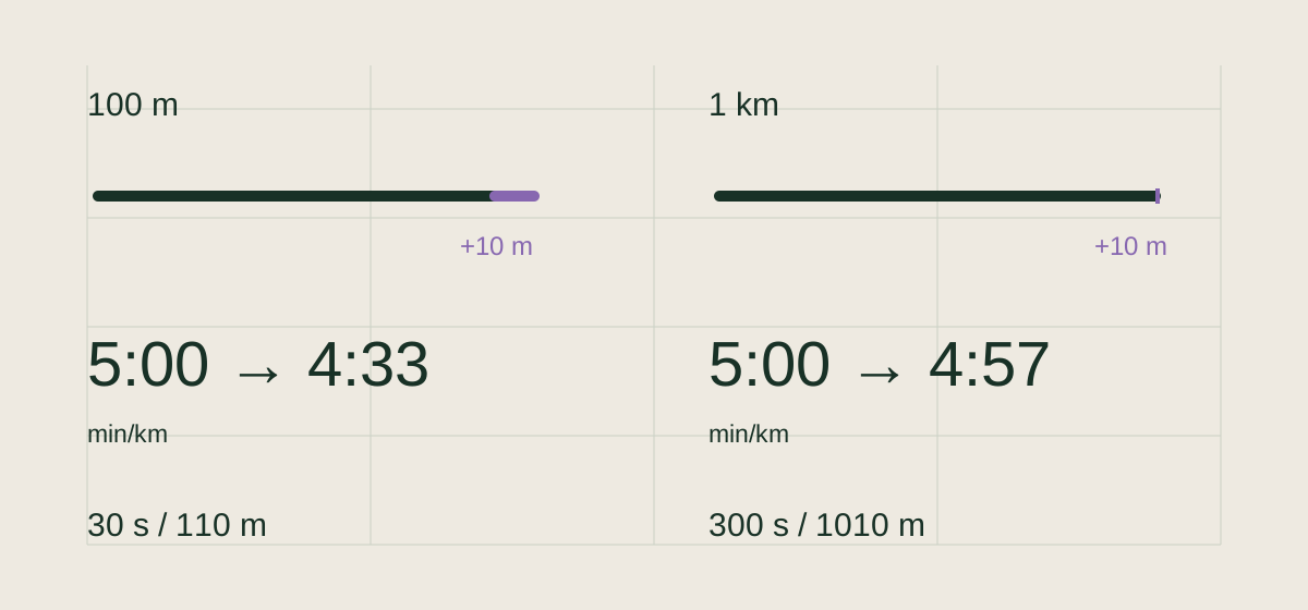
A short window magnifies a distance difference
At a steady 5:00 min/km, 100 meters takes 30 seconds. If a hypothetical distance record says 110 meters for that same interval, the calculated pace becomes about 4:33 min/km. Over 1,000 meters in 300 seconds, a record of 1,010 meters gives about 4:57 min/km. The same 10-meter difference has a much smaller relative effect.
This is a sensitivity example, not a specification for any device. A positional accuracy radius is not the same thing as an error in accumulated running distance. GPS.gov explains that signal blockage, reflections and receiver characteristics affect the position a device reports.
More samples are not automatically more truth
A sample is a measurement at a particular moment. Closely spaced samples can share the same obstruction or sensor problem. A line connecting two observations shows the connection; it does not prove every value between them was measured. A visually smooth curve cannot restore missing observations.
An instantaneous pace point and a kilometer split also answer different questions. The first describes a short interval; the second combines a much longer distance and time. A brief surge can be real even when it barely changes the kilometer average. Longer is not automatically better for every question.
Precision is a display choice
Showing 5.003 km instead of 5.00 km adds digits, not evidence. Before interpreting a small change, inspect the route, recording source and uninterrupted parts of the activity. Compare longer, similar sections when the immediate pace looks erratic; keep meaningful intervals separate rather than smoothing away their purpose.
Use the detail behind the headline
Runome brings the recorded route and available activity streams into the run detail view. Use that context to decide which comparisons the record can support. A chart is most useful when you can distinguish a measured change from a question that the available data cannot answer.
Check supported running-data connections